Tada Yoga App
UX | UI | Brand Design
I designed a cloud storage app that centralizes yoga-related content for yoga instructors.
View PrototypeI designed a cloud storage app that centralizes yoga-related content for yoga instructors.
View Prototype
Tada is an app that gives teachers the ability to save, share, and create yoga-related content. As yoga grows in popularity, you can find yoga content everywhere. You can upload or view yoga videos on YouTube, save yoga-related articles on a board in Pinterest, or create your own sequences with Gaiam’s Yoga Studio app -- but you can’t keep this content all in one place.
Using a user-centered design approach, I created the initial prototype for an app that gives users a place to view, save, and create yoga-related content in one centralized location.
Competitive Analysis
User Surveys
User Personas
User Stories
User Flows
Wireframes
Mockups Prototypes
User Testing
Branding
Google Forms
Sketch
Figma
InVision
Maze
I began by conducting a competitive analysis. From my experience, there weren’t any products out there that did what I needed them to do. I wanted to dive in and see what exactly it was they were missing and what potential there was in the market.
I compared three cloud storage yoga apps: Yoga Studio, Yoga Academy, and Yoga Journal. The main issues I found?

Poor user interface

Faulty cloud storage without proper synching

Lack of versatility
From there, I wanted to find out more about my target audience. Who are they? What do they need? I analyzed the yoga app needs of 44 users aged 18 to 74 and discovered that about 86% of yoga instructors wanted to be able to save content and almost half of all users wanted to be able to create their own sequences.
View Research >>From that analysis, 3 user personas emerged: the experienced teacher/studio owner, the new teacher, and the experienced yoga student on the go.

Running a yoga studio takes a lot of time. So much so that Madhav doesn't teach as much as he used to. He misses the connection he used to have with his students.

Amber's work schedule takes up most of her day and she'd like to make more money. She doesn't know when she'd have the time to add more to her plate.

Working as a consultant makes it difficult for Kris to establish a routine. She is concerned about money, and only wants to live this nomadic lifestyle until she can pay off her student loans.
Before I started building out the prototype, I needed to set up goals, or user stories, to avoid scope creep. I kept my focus on three user stories:


Next, I mapped out the user flow to get a better understanding of how the user would go through the processes of creating a sequence and saving content.
I included some edge cases in the flows as well to illustrate what would happen if a user encountered a problem, such as searching for a pose but it wasn’t there.
View More >>Once I had an understanding of how the user would move through the app, I began to work on wireframe sketches. Using pencil and paper, I sketched out my ideas for different functions on the site. I sketched out the homepage, an article view page, and a sequence page.
Next, I used Figma to design a digital wireframe. This helped me further visualize and refine how the content would be spaced out.
View Wireframes >>

Branding was an important consideration for this product. There are many yoga-related apps that have similar names, colors, and logos. It was critical to understand what made those brand messages popular and how Tada could stand apart from the crowd.
Tada’s name was chosen from the sanskrit word “tadasana” meaning mountain pose. Mountain pose is a grounding pose in yoga and is used often as the beginning and start of a vinyasa or sun salutation. The app’s purpose is to provide foundation and grounding in their yoga practice so I thought this name would convey that feeling well.
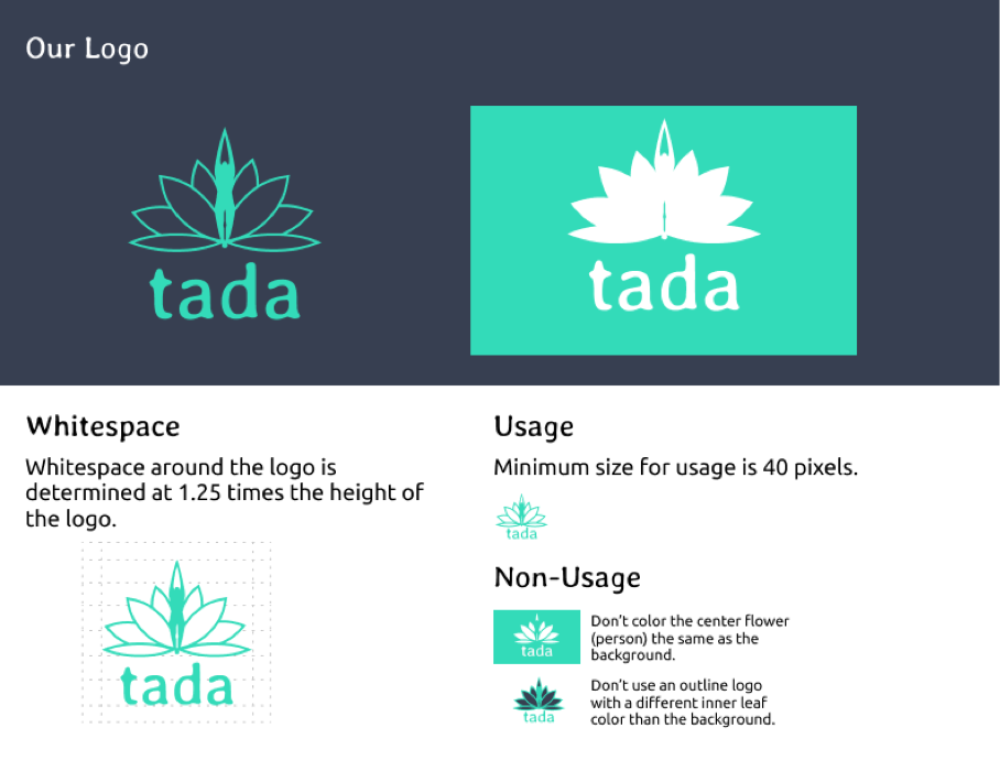
I chose green as Tada’s main color because it symbolizes growth and guidance. I wanted the app to be a place where users could learn and grow in their practice and teaching of yoga.
Creating Tada’s logo was difficult. There are a multitude of different wellness apps on the market and a lot of them use the lotus flower as a logo. I too, used a lotus flower. It is a strong symbol in the yoga community and is easily recognizable. To make it stand out from the rest, I made the center leaf of the flower look like a silhouette of someone doing mountain pose. This tied the logo and the name together seamlessly.
View Style Guide >>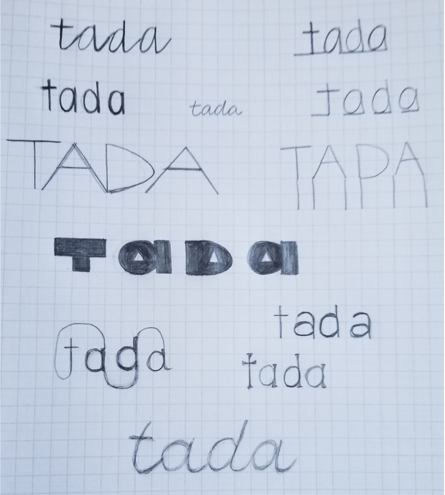

After building out the wireframes, I began creating low fidelity mockups to use in the first round of user testing. These mockups had one main issue: users were unsure of how to save an article.
The next step was to use the branding style guide (see below) to create a high fidelity prototype and test it. I created both mobile and desktop versions of the prototype. These high-fidelity prototypes went through a final round of testing. That testing showed that changes made to the “save article” function were successful, but now users were having trouble saving their custom sequence and signing up for an account.
View Mockups >>I conducted preference testing for the article save buttons (using a circular “add” button versus a rectangular “save” button) to determine what would be most effective.
Results showed that 86% preferred the rectangular “save” button.
Due to the results of the preference testing, I changed the button to the rectangular “save” button and in the last round of testing, 100% of users were able to complete the article saving task effectively.

User testing proved very useful. During the first round, users had one main issue: saving an article. The buttons and interface were not intuitive enough and users were unsure where the process was leading them.
As a result, I changed the button for saving an article and separated out the sharing functions.
During the second round of user testing, 100% of users were able to easily save the article and new issues emerged. The main issue users had was finding the sign up page. The option to sign up for an account wasn’t clear enough. The other issue users had was saving their sequence. The original functionality was using a back button to navigate to the edit sequence page.
After the testing, I added hierarchy to the log in/sign up process and added a sequence editing card to the sequence building page.
View Test Analysis >>The research was very conclusive in this project and it very clearly pointed out designs that weren’t working for the user, most specifically the article save button.
I assumed that saving information would be the simplest task. I was surprised to see the impact that just changing a button type had (circular add versus rectangular”save”) on the usability of the app. Given more time, I would have taken a deeper dive into the “create your own sequence” function of the app and conducted more user research and usability testing specifically within that function.
My biggest lessons that I learned throughout this project were in the visual design aspect of the project. Adding additional hierarchy and changing button visuals made a huge impact in how people were able to access the features of the app. In the future, I will approach designs with more detail from the beginning - thinking how an extra step might help funnel the user better and question how I would get to that point with no knowledge about the design.
View Prototype